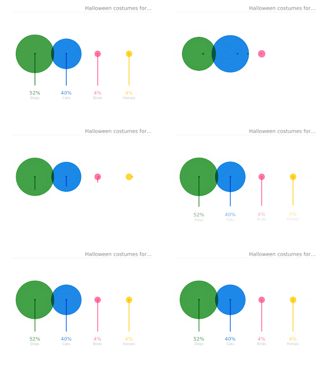
Beyond helping readers to compare and contrast numbers, data
visualizations can be key to great storytelling.

While telling stories
with data might sound complicated, useful data visualizations don’t have
to be complex. In 2017, we launched the Data GIF Maker
tool that makes it easy for people to make simple visuals that compare
two terms.
Using the tool, people around the world made GIFs around
everything from comparing two famous fonts to two favorite dishes.
For more details Click to read
By Simon Rogers


No comments:
Post a Comment